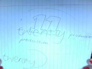
This was our first idea for our prouction company logo. The idea of 'Twenty 11' at first seemed up to date and simple. We thought it was short and snappy, but we soon realised that it wouldn't really mean much after the year of 2011. It would quickly become outdated.
We then came up with the idea of Skyline Productions. This is our initial idea for the logo. We thought that the the seperate letters had a good effect as it emphasied our production name, making sure the viewer was drawn straight to our company name.
This is the final company logo. We chose the name Skyline Productions because it is modern and is also quite futuristic, due to all the large buildings. Cities are sometimes the setting of thriller films, which also ties in with the Skyline idea. The image comes across as a big, 'blockbuster' logo, with high budget, up to date technology and experience in the film making world.


No comments:
Post a Comment